Designed by Inkahoots and Type As Image

The new Scribe website and branding
The Scribe team is thrilled to announce that the new Scribe website, designed by Inkahoots, and all new branding, designed by David Pearson ofType as Image and Paul Barnes, are now officially launched!
Designed and developed by Australian multi-disciplinary design studio,Inkahoots, the new Scribe website features a beautifully designed, rationalised interface with the latest cutting-edge technology, making it an intuitive pleasure to use. Improved functionality includes the interactive viewing of books, allowing you to click on, rotate and scale 3D-rendered models of books, as if you were holding up one of our books in a bookstore.
The site also has a new streamlined checkout process and rich multimedia content. Improved technology includes an automated syncing system linking all book data from the BooksoniX database for accurate, live information, and the site is built using the Nuxt framework, delivering maximum speed and efficiency.
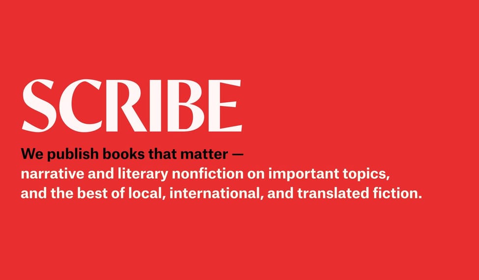
Scribe's all new branding has been designed by David Pearson ofType as Image, and type designer Paul Barnes.
The design rationale:
‘I was approached by Miriam Rosenbloom – the Publisher of Scribble Kids Books, and former Art Director of Scribe – with a view to modernising Scribe's logo. Scribe is a family-run business. It was founded by Miriam’s father Henry in 1976, and its first logo was drawn by his father Felix, (a redrawing of American Uncial, designed by Victor Hammer in
1943).
We've seen a good deal of logo vandalism in recent years, with designers too-often justifying their roles by sanding, smoothing, and generally depersonalising character-rich
identities. The current visual landscape feels much the poorer for it.
Working with type designer Paul Barnes, we aimed to land somewhere stylistically interesting, like our starting point, and respect the company’s lineage. So the new logo is a rationalisation, but not at all costs. It bridges the styles of a hand-drawn letter made with a pen, and a more formal serif-style form. It is historical in basis, but contemporary in style and outlook.’
– David Pearson
David Pearson is a graphic designer based in London. He has been commissioned by Wes Anderson, Christie’s, Ferrari, Luca Guadagnino, Hermès, The New York Times, Penguin Books, Sir Ridley Scott and the V&A. David has been listed as one of Britain’s Top 50 Designers by The Guardian, is a member of the prestigious international association Alliance Graphique Internationale (AGI), and in 2015 he was appointed Royal Designer for Industry, the highest accolade for designers in the UK. He is also founder of The Book Cover Review.
Paul Barnes is a type designer and partner in the London and New York based type foundry, Commercial Type. He has designed typefaces for Björk, The Guardian, the National Trust in England, Visa, the V&A, the numbers for Puma at the 2010 World Cup, and also the England football team for Umbro. Paul has also designed numerous faces for Commercial Classics, a project reviving historical faces from St Bride Library in London. He is also a member of Alliance Graphique Internationale (AGI).
The Scribe website is a beautifully designed, vivid new home for our books and authors, and a world of interactive exploration for our readers. Welcome, and we hope you enjoy it here.